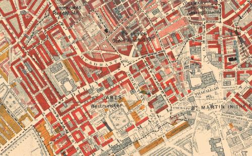
The London School of Economics has online Charles Booth's groundbreaking "Poverty Maps" of London from 1886 to 1903 they used survey data to visually represent the quality of life for Londoners across a city that was characterised by enormous economic disparity. The LSE maintains an archive of the maps, zoomable and overlaid with the contemporary London map. The maps are colored from black ("Lowest class. Vicious, semi-criminal.") to yellow ("Upper-middle and Upper classes. Wealthy.") Link and if you follow this link you will see our street "Brayburne Avenue in the middle with pink shading representing : Fairly comfortable. Good ordinary earnings. Today I think the street would be pink and red : Middle class. Well-to-do .
London today is still "a city that" is "characterised by enormous economic disparity."
Comments